
关于Matplotlib工具
导入依赖
import matplotlib.pyplot as plt |
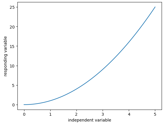
Line chart
x_data = np.linspace(0, 5, 100) # Sample data |
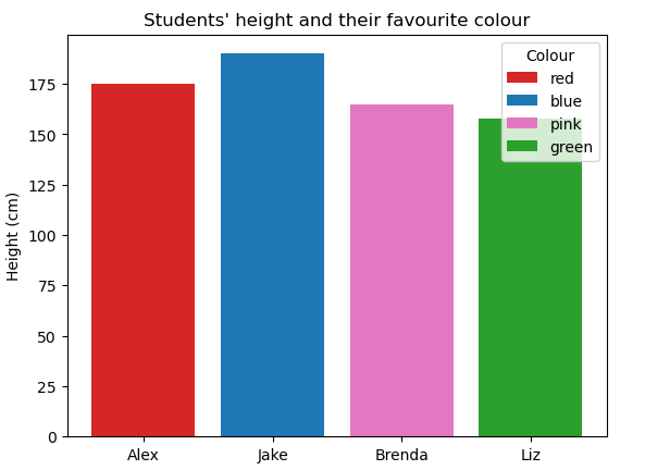
Bar chart
fig, ax = plt.subplots() #to plot on same axes |
Pie chart
students = ['Alex', 'Jake', 'Brenda', 'Liz'] |

marker and linestyle
在 matplotlib 中,marker 参数用于指定图表上数据点的标记样式。'o' 是一个圆圈标记,用于在图表的每个数据点位置绘制一个小圆圈。除了圆圈外,还有许多其他类型的标记可供选择。
下面是一些常用的 matplotlib 标记类型:
'.': 点'o': 圆圈's': 正方形'^': 向上的三角形'>': 向右的三角形'<': 向左的三角形'v': 向下的三角形'p': 五角星'*': 星号'+': 加号'x': 叉号'D': 菱形'H': 六边形1'8': 六边形2
您可以在 plot 函数中使用 marker 参数来指定这些标记中的任何一个,例如:
plt.plot(x, y, marker='*', linestyle='-') |
这将在图表的每个数据点上绘制一个星号。选择哪种标记类型通常取决于您的个人喜好,以及哪种标记能在您的图表中提供最好的可视化效果。
在 matplotlib 中,linestyle 参数用来定义线条的样式。这对于区分图表中的不同数据系列或改善图表的可读性非常有用。以下是一些可用的 linestyle 选项:
'-'或'solid': 实线'--'或'dashed': 虚线'-.'或'dashdot': 点划线':'或'dotted': 点线''或'None': 不画线
您可以根据需要选择其中的任何一个样式来自定义您的折线图。例如:
plt.plot(x, y, linestyle='--') # 会绘制虚线 |
本博客所有文章除特别声明外,均采用 CC BY-NC-SA 4.0 许可协议。转载请注明来自 Xiaotan's Blog!
 微信
微信 支付宝
支付宝
评论